Share This Article
A first look at Thesupermade Inc can suggest a label built around one thing: making a familiar streetwear shape feel more graphic. The store spans tops, outerwear and bottoms, with prints, contrast panels and layered-looking details doing much of the visual work.
For a new reader, the useful question is how that point of view carries across the range. We reviewed the brand’s product information and pages, rather than relying on wear testing. The examples below show how its design language shifts from statement tops to relaxed separates, and what to check when choosing a starting piece.
We may earn a commission when you buy through links on this page, at no extra cost to you.
A graphic point of view
Thesupermade Inc works in recognizable wardrobe categories, then gives them a more assertive surface treatment. Instead of making every item depend on an unusual cut, the range often uses print, patchwork, contrast or a faux-layered effect to create its identity. That makes the label easy to read visually. The design-led approach also asks the wearer to decide how much attention a single garment should draw. A quick browse through the current Thesupermade Inc collection makes that mix of silhouettes and surface treatments easier to compare.
The Cut-Out Slim Long Sleeve Tee is a clear example. Its cotton-blend construction, rounded neckline and full sleeves keep the basic role familiar; horizontal cut-outs over a black underlayer supply the unusual detail. The product description calls the fit relaxed slim and positions it for spring through autumn. A reader considering the cotton-blend tee should weigh that body-skimming outline against its bold chest design, and check the size chart before choosing. The brand listing also recommends cold hand washing and flat drying, care details that matter for a cut-out construction.
Across the store, a few recurring choices help explain the range:
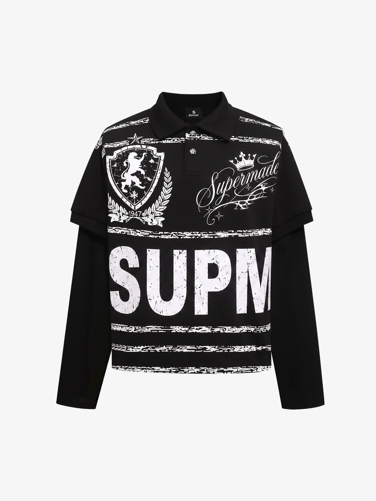
- Graphic emphasis: text, portrait imagery and motifs turn simple tops into outfit focal points, as on the typography long sleeve tee.
- Contrast as construction: panels, stripes and layered effects add depth without changing the garment’s basic function.
- Relaxed proportions: wide-leg bottoms and roomy outerwear balance more fitted or detailed tops.
Print meets proportion
Bottoms make the brand’s point of view less dependent on a graphic tee. The Zebra Patch Star Graphic Wide-Leg Sweatpants pair a light grey base with zebra-print patchwork and star graphics. Their wide leg makes the silhouette itself part of the statement, while the pattern gathers attention around the lower half. Product details describe an elastic drawstring waist, a practical feature that lets the wearer adjust the fit.
This type of piece works best when the rest of an outfit gives its surface room. A plain top or restrained outer layer can make the patches legible; adding another large print may create competition. That is a styling inference from the product’s stated pattern and shape, rather than a claim from the brand. Review the garment measurements and care instructions on its product page before deciding whether the volume suits your wardrobe.

A different route is a top that uses graphics within a more conventional collar shape. The Zebra Letter Graphic Collared Long Sleeve Tee combines a collared neckline with zebra and letter motifs, according to its listing. The cotton-blend composition and seasonal guidance are described on the collared tee product page. It offers a useful middle ground for someone who wants visible design but prefers the familiar structure of a collared shirt. Compare its fabric and sizing notes with the cut-out long sleeve tee before choosing between a print-led and cut-out-led look.
Range beyond graphics
Not every item relies on a loud print. The Textured Knit Wide-Leg Drawstring Pants use a burgundy marled surface and contrasting cream waistband, with a wide shape and drawstring construction. The knit pants listing describes its marled surface and contrast waistband. This moves the range toward texture and color blocking: still distinctive, but less dependent on an all-over illustration. It may be the more adaptable entry point for readers who like a relaxed silhouette and want the garment’s surface to carry the interest quietly.
When comparing these options, look beyond the headline image. Check the listed fabric composition, garment measurements, fit description and care guidance. Those details help answer everyday questions that a photograph cannot: whether a knit feels suitable for the season, how much room a wide leg gives, and whether the print or texture will work with pieces already in rotation.
- Choose the role first: layering top, focal top or relaxed bottom.
- Use the size chart and garment measurements, not a general assumption about fit.
- Check material and care notes, especially for textured or layered-effect pieces.
- Build around one visual feature if you want the outfit to feel balanced.
Readers drawn to print can compare the pants with the zebra patch sweatpants; those who prefer texture can inspect the Textured Knit Wide-Leg Drawstring Pants. The pages offer the relevant specifications and current availability. Cost may vary by garment and selected options, so consult the store for current details rather than relying on an old article.
One last look
Thesupermade Inc has a coherent identity built from graphic surfaces, contrast and relaxed proportions, with enough variation to move from statement tops to more texture-led separates. The range has breadth across layers, tees and bottoms, and its product pages give concrete information about fabrics, fit and construction. This approach can help readers who like expressive clothing but prefer to make an informed choice garment by garment. The visual system is clearest when a product has one dominant feature, whether that is cut-out shaping, patchwork or textured knit. A first purchase makes most sense when it fills a clear role in the reader’s existing wardrobe. The limitation is that many designs are visually specific, so versatility depends on how readily they coordinate with simpler basics. Fit remains personal, too: listed descriptions are useful, but measurements are the better guide when deciding between sizes.
We would start by comparing the product details and measurements for one category, then choose the level of graphic emphasis that feels wearable beyond a single outfit.
For a first look at the label, choose one well-described piece whose graphic detail fits the way you already dress.